iSearchFrom
Client
iSearchFrom
Role
- Product Designer & Design Engineer
Category
B2B SaaS · Search Visibility
Year
2025-Present
iSearchFrom shows SEO teams and agencies how a brand appears in Google, Google Maps and AI answers, checked from any country, city or map pin. I joined to turn a decade-old free utility into a paid platform, and I now lead design and frontend across the whole product: the app, the design system, the marketing site and the new white-label client portals. We are a two-person product team. I own the experience end to end, from research and UX architecture to the shipped SvelteKit code, and a backend engineer owns the API and infrastructure. I design directly in code with AI agents, so what I design is what ships. The new platform launched in August 2026 and has shipped new capabilities almost every week since.
Challenge
Turn a trusted, free one-page SEO utility into a paid visibility platform for teams and agencies, without losing the speed and simplicity that made people love it.
My Role
Product Designer & Design Engineer. I own research, UX architecture, the design system and the SvelteKit frontend for the app, the marketing site and client portals. A backend engineer owns the API and infrastructure.
Key Decisions
- Kept a free search path after the paid-only MVP backlash, then made it the front door of the new site.
- Built one design system that the app, the marketing site and the client portals all share.
- Treated failed and partial data as designed states, so a missed check never reads as a lost ranking.
- Settled the landing hero with an A/B test instead of opinions.
Outcome
Launched the new platform in August 2026. The winning hero layout doubled the share of visitors who tried the real-IP search (68% vs 34.8%), and white-label client portals with 57 report blocks are in final QA.
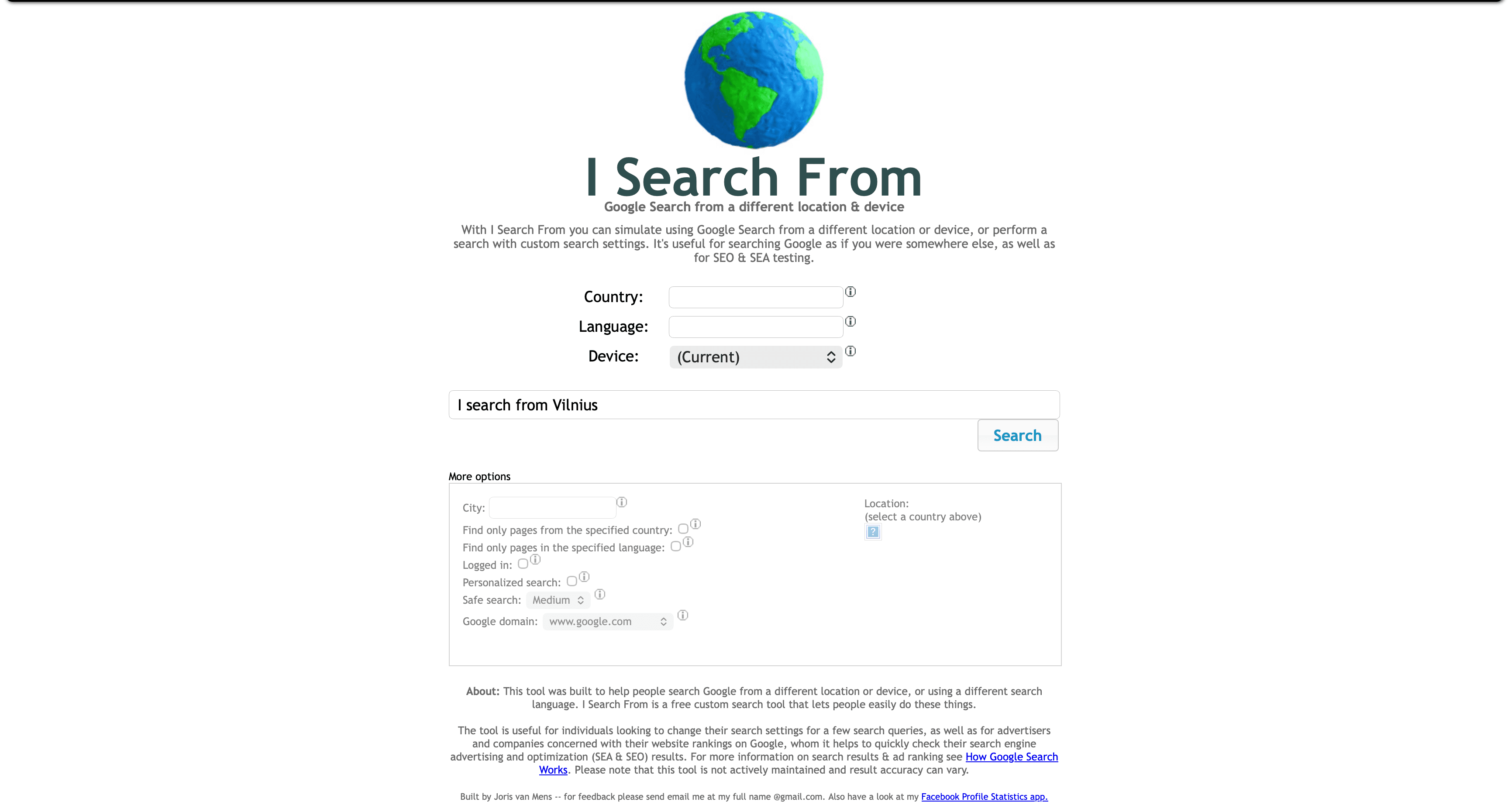
The original iSearchFrom. Utilitarian, dated, and deeply trusted.
Where It Started
A Free Utility With a Decade of Loyalty.
For more than ten years, iSearchFrom was a single free page: type a query, pick a country, and see Google the way someone there would. SEO and PPC specialists bookmarked it, linked to it and used it every day. It looked like 2010, and nobody minded.
The job was never just a redesign. It was turning a beloved free tool into a product people would choose to pay for, with features worth the price and without breaking the habit that kept people coming back.
Research
Validating Proxies, Discovering AI Tracking.
Together with one of the stakeholders, I tested whether users of the free URL modifier would pay for a real-IP search that shows true local results and ads. We mined specialist SEO communities for frustrations with existing tools, then interviewed working marketers.
Demand for an accurate proxy search was real. The bigger finding was a shift nobody had asked us about: marketers were seeing traffic arrive from ChatGPT, Gemini and other assistants, and had no way to see how those assistants talked about their brand.
"We are seeing lots of visits from ChatGPT, Gemini, and other chatbots. Google is being replaced, and we need to track not just ads on Google, but also organic results and future ads within these chatbots."
That one insight widened the product. Alongside a better Google proxy, we committed to tracking AI answers the same way marketers already tracked rankings and ads.
MVP & Pushback
The Paid MVP Broke a Daily Habit.
In December 2025 we shipped a paid MVP built around the new Search Engine Proxy and retired the free tool. Agencies that needed local ad data adopted it quickly. Long-time users filled the inbox.
Instead of defending the decision, we asked them how the old tool fit into their day. The answer was speed: one query, one country, no login. We quickly brought back a modernised free search and the complaints died down. That lesson shaped everything after it: the free path is not a leak in the funnel, it is the front door.
Course Correction
From Stripped-Down Tool to Front Door.
My first modernised free tool (left) carried too much of the paid product's structure and felt like a demo of something you could not have.
On the new site, free search sits in the landing hero (right): one card with country, city and language, and a clear second path to the real-IP search when accuracy matters.
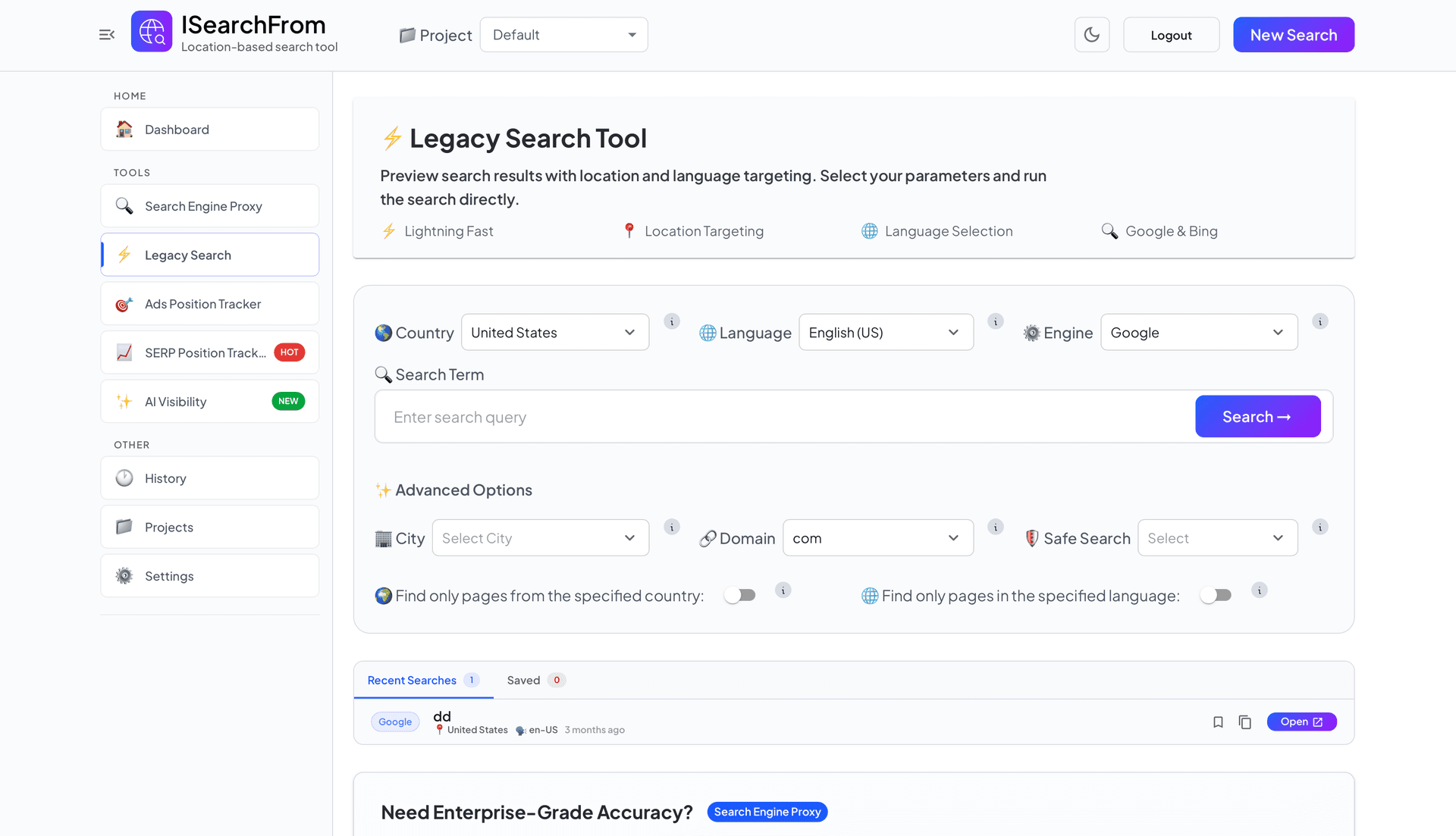
December 2025: the first attempt at a modern free tool, with too much enterprise structure.
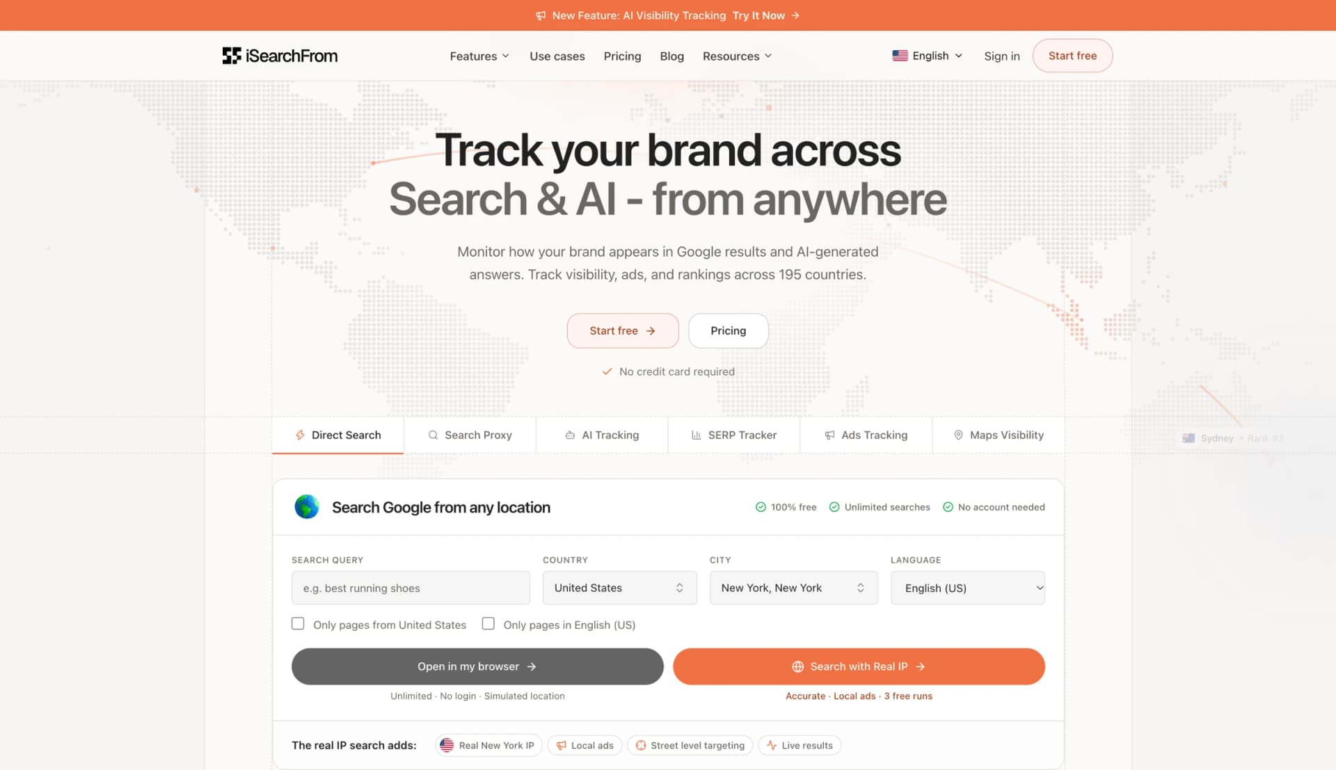
Today: free Direct Search is the first thing on isearchfrom.com, with the paid real-IP search one click away.
Search Engine Proxy
From MVP Form to Working Instrument.
The MVP proxy (left) proved people would pay for real local results, but the form and the results competed for the same space.
In the shipped version (right), configuration lives in a fixed left rail and the result gets the rest of the screen, rendered inside the device it was searched from. Searches are saved to history, shareable by link and comparable side by side.
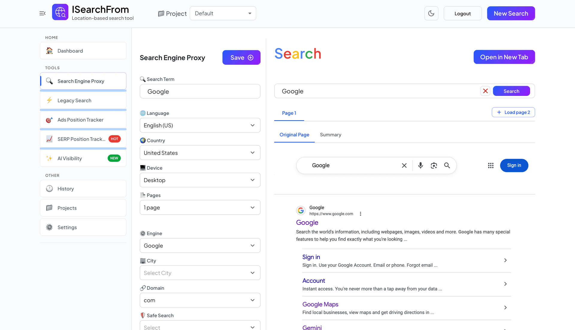
MVP, December 2025.
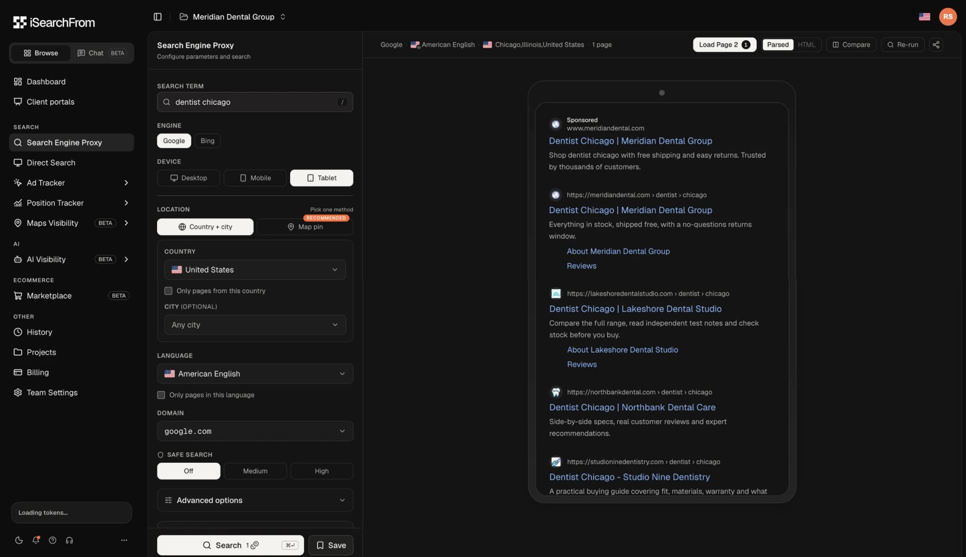
Shipped: settings rail on the left, the live result in the device frame it was searched from.
Fixing a responsive layout bug with an AI agent and checking it straight in the browser.
Designing in Code
From Prototype to Production Monorepo.
Figma stayed in the toolkit for brand and logo work, but I designed the product itself in code. From February to April 2026 I built a standalone SvelteKit prototype on mock data: dashboards, an AI visibility setup wizard, a mobile proxy search. Stakeholders could click through real interactions weeks before the backend existed.
In April I moved into the production monorepo alongside our backend engineer. There is no handoff: the components I design are the components that ship, wired to the API as it lands. AI agents write much of the first draft, and I spend my time on the last 20%, where the product starts to feel right.
"AI is incredible at getting you to 80% completion in record time. But stepping out of Figma and using AI to generate functional UI code forces you to confront the reality of the browser, ensuring the final 20% is pixel-perfect."
Design System
One System, Every Surface.
I built and maintain the shared UI package the platform is made from, and wrote most of its commits (136 of 177). The app, the marketing site and the client portals are all built from it.
• Type and colour: Geist and Geist Mono on warm neutrals, with one orange accent reserved for primary actions.
• Charts: a 10-colour data palette validated for colour-blind safety and contrast. Series always take colours in the same order, because the order is what keeps neighbouring lines distinguishable.
• Themes and languages: every screen works in light and dark, in English and Brazilian Portuguese.
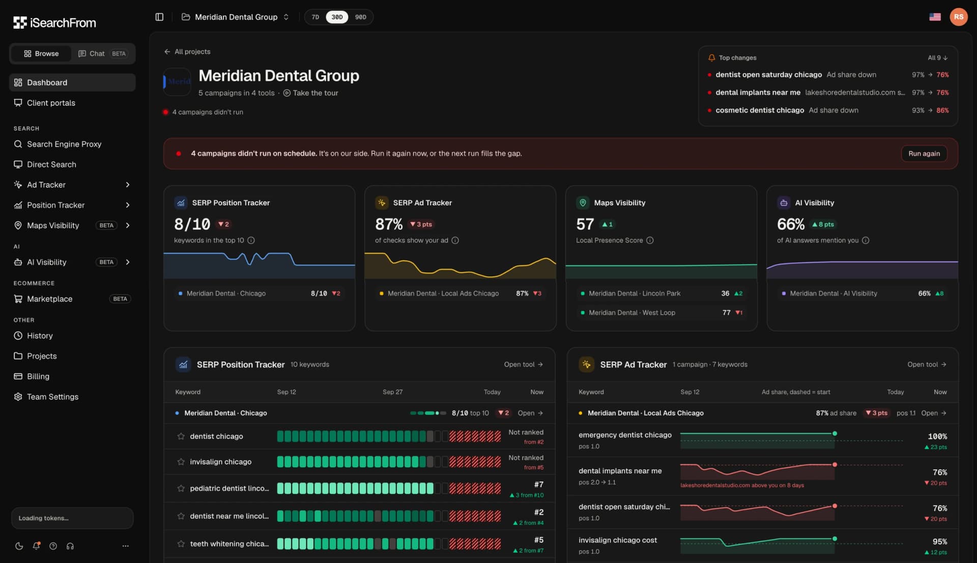
Project dashboard in the dark theme.
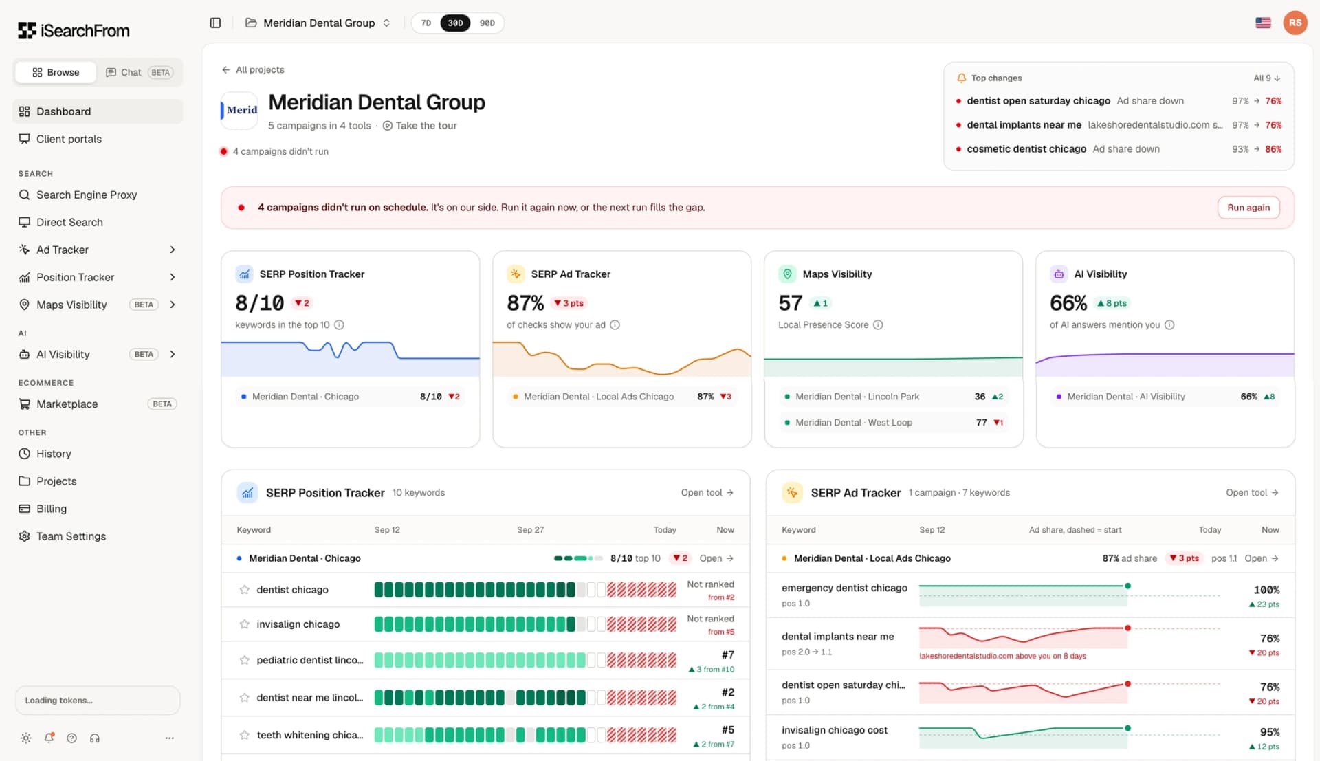
The same screen in light: same tokens, same hierarchy.
The Platform
Every Place a Customer Might Find You.
The new platform launched on August 4–5, 2026, with sign-in moved to app.isearchfrom.com and existing accounts migrated. Since then we have shipped something new almost every week: Maps Visibility, an AI Data Chat that answers questions about your own data with charts, Amazon, Walmart and Google Shopping tracking, team access control and an MCP server for AI agents.
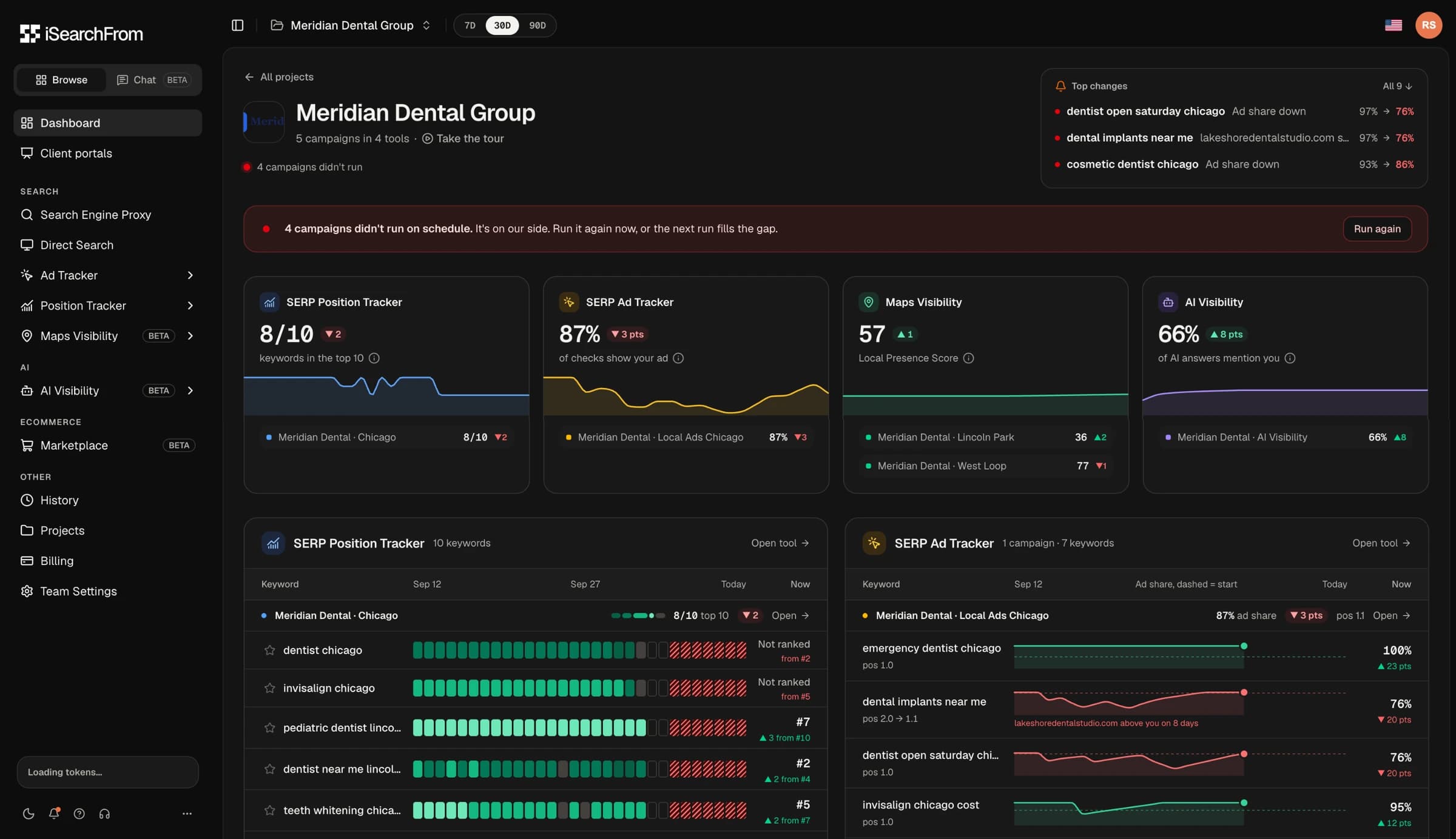
Every tool answers one question first and offers detail second. The dashboard leads with the four numbers a client asks about (top 10 keywords, ad share, local presence and AI mention rate), and each one links to the evidence behind it.
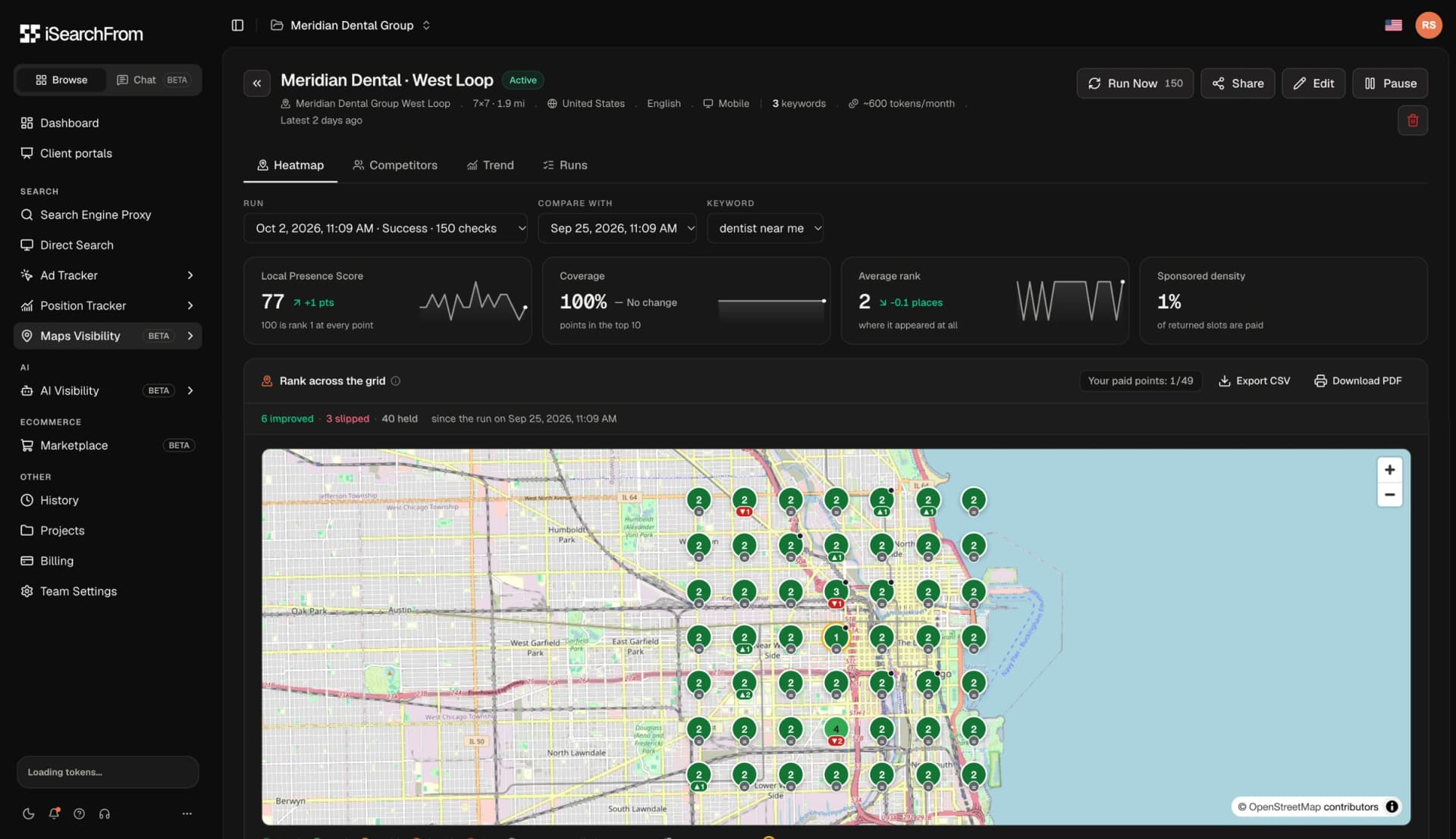
Maps Visibility: a 7×7 grid of Google Maps checks around each office, compared run over run.
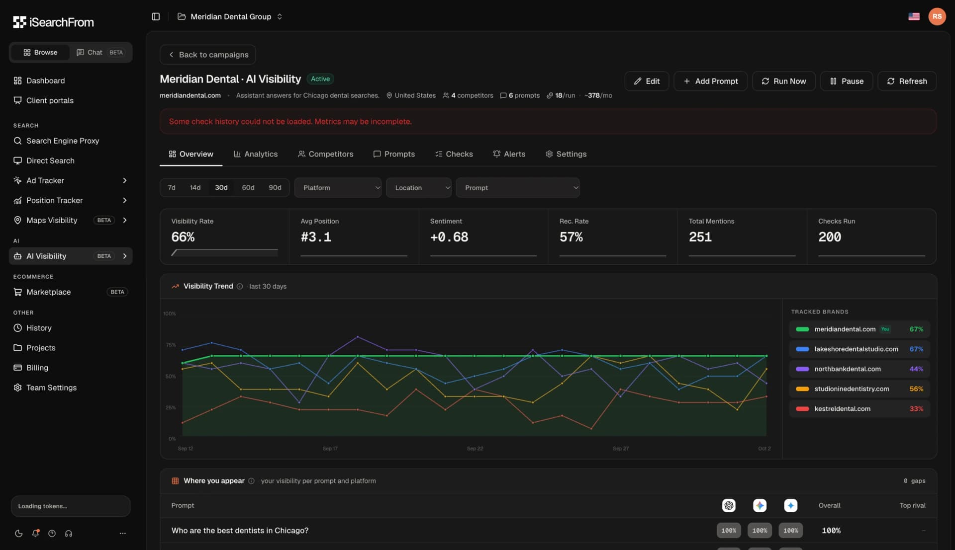
AI Visibility: how often AI assistants mention the brand, and who they name instead.
Data Honesty
Failure Is a State, Not an Error.
Monitoring tools fail quietly: a check times out, a source returns nothing, a run is skipped. The worst outcome is a chart that turns a failed check into a ranking drop, and a client who panics about something that never happened.
One rule runs through the product: a failed check must never read as "not ranked". Missed runs are drawn as hatched cells, stale data says how old it is, and when the fault is ours the banner says so plainly: "It's on our side. Run it again now, or the next run fills the gap."
The screenshots on this page come from our demo workspace while its scheduled checks were failing. I left those states in on purpose. They are part of the product.
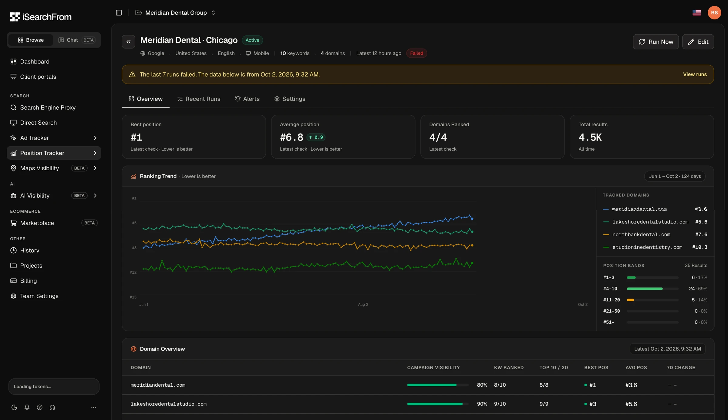
A campaign whose last seven runs failed: the page says so, shows when the data is from, and keeps the history intact.
Onboarding
Getting to the First Real Answer Faster.
I rebuilt the first session around one goal: get every new account to a real result about their own site as fast as possible.
• Welcome screen: I explored five art directions side by side in a lab page, then retired the illustrations for a scannable list of tools. Clearer beat prettier.
• First campaign as an onboarding step: setup opens with the signup domain filled in and measures from the user's own country, so the first result is about them.
• Trial offer: the offer opens with the user's real rank, partly hidden, so the value is concrete before they decide.
Experiment
Settling the Hero With an A/B Test.
Early relaunch data showed visitors picking the free search roughly three to one over the real-IP demo, even though the demo was visually promoted. Trying the real-IP search is what leads people to sign up and stay.
I set up a test with a single variable: two parallel buttons (control) against two radio cards with one submit button and the real-IP option preselected. Copy stayed identical in both arms. The radio layout roughly doubled the share of hero users who tried the real-IP search: 68% against 34.8%, across about 23,800 sessions. It became the default.
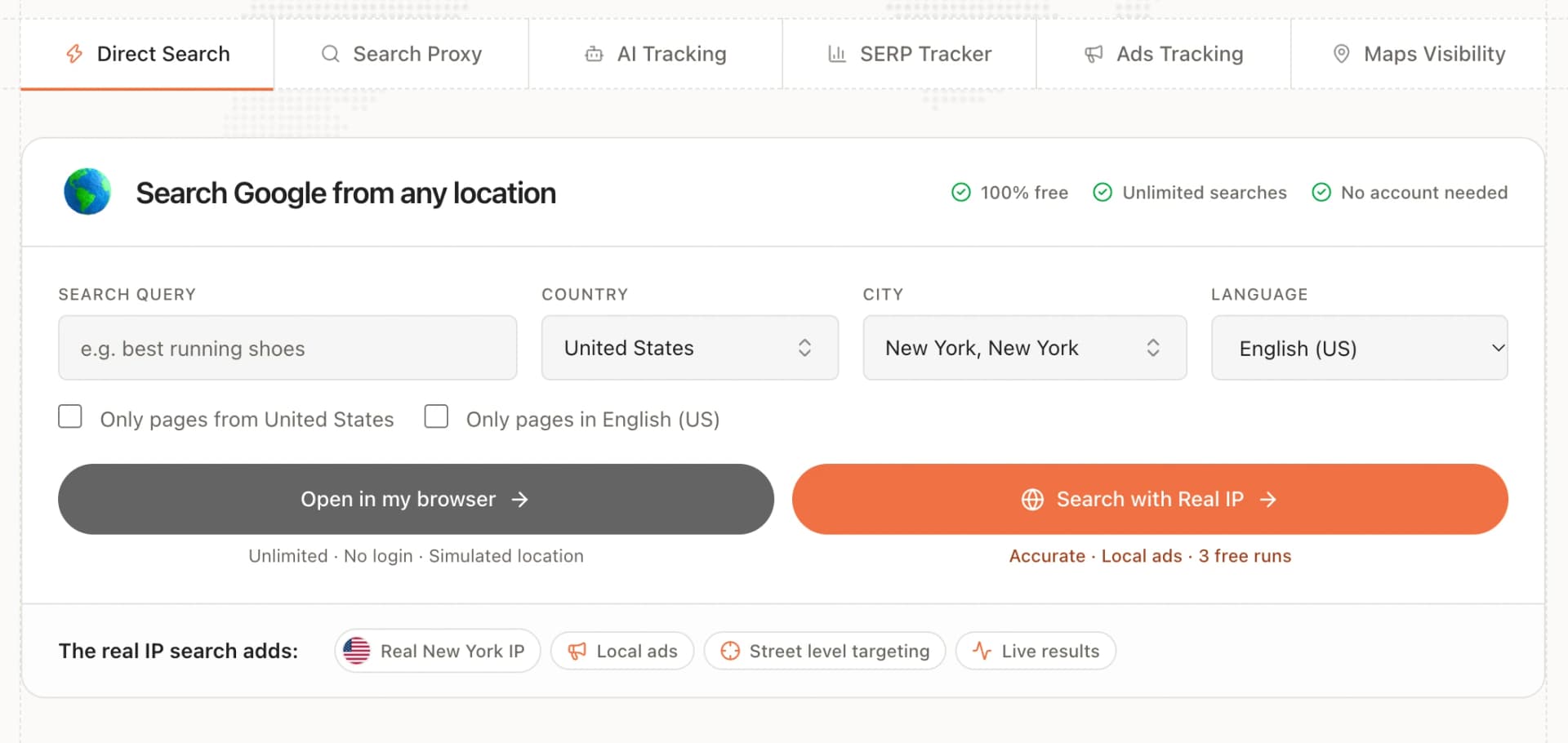
A · Control: two parallel buttons.
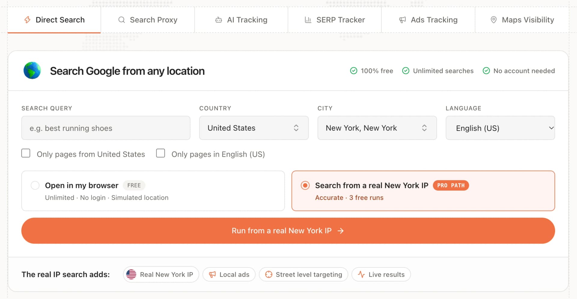
B · Winner: a radio choice, one submit button, real-IP search preselected.
Marketing Site
Fast, Findable, and Honest About Free.
I also own the marketing site. A performance pass replaced the 10,000-dot world map behind the hero with a rasterised mask: the worst-case Safari frame rate went from 15 to 59 fps, the longest frame from about a second to 33 ms, and the home page HTML shrank by 84%.
After the relaunch I tracked search performance closely, restored a utility-first homepage title when branded click-through dipped, and added country landing pages for people searching for Google from a specific place.
Feature Deep Dive
Client Portals: Reports Agencies Put Their Name On.
Agencies do not just track search visibility, they explain it to clients every month. Client portals turn the data an agency already tracks into a branded report page their client opens, a PDF and a monthly email, all in the agency's name and all drawn from live data.
I designed and built the whole feature: the editor in the app, the client-facing portal and its library of 57 report blocks across rankings, ads, Maps, AI answers and store shelves. It is the largest piece of work I have shipped at iSearchFrom, and it is in final QA ahead of release on the Agency plan.
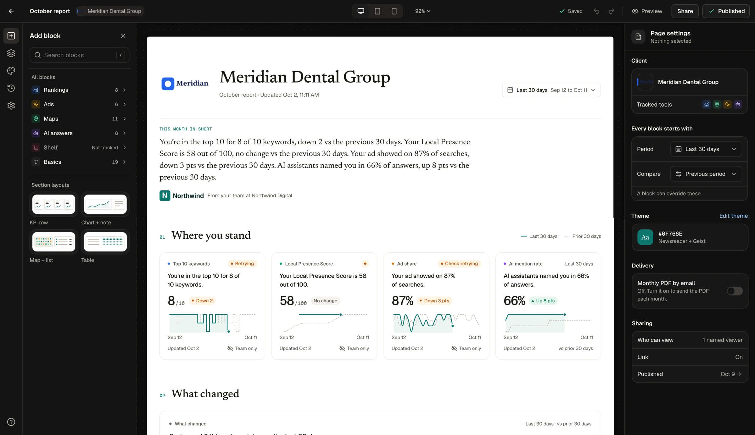
The portal editor: block library on the left, a live 12-column page in the middle, page settings on the right. Every block starts from the page's period and comparison and can override them.
The Client Page
Written for the Client, Not the SEO.
A client should understand the page without a call, so every block opens with an answer before it shows a chart.
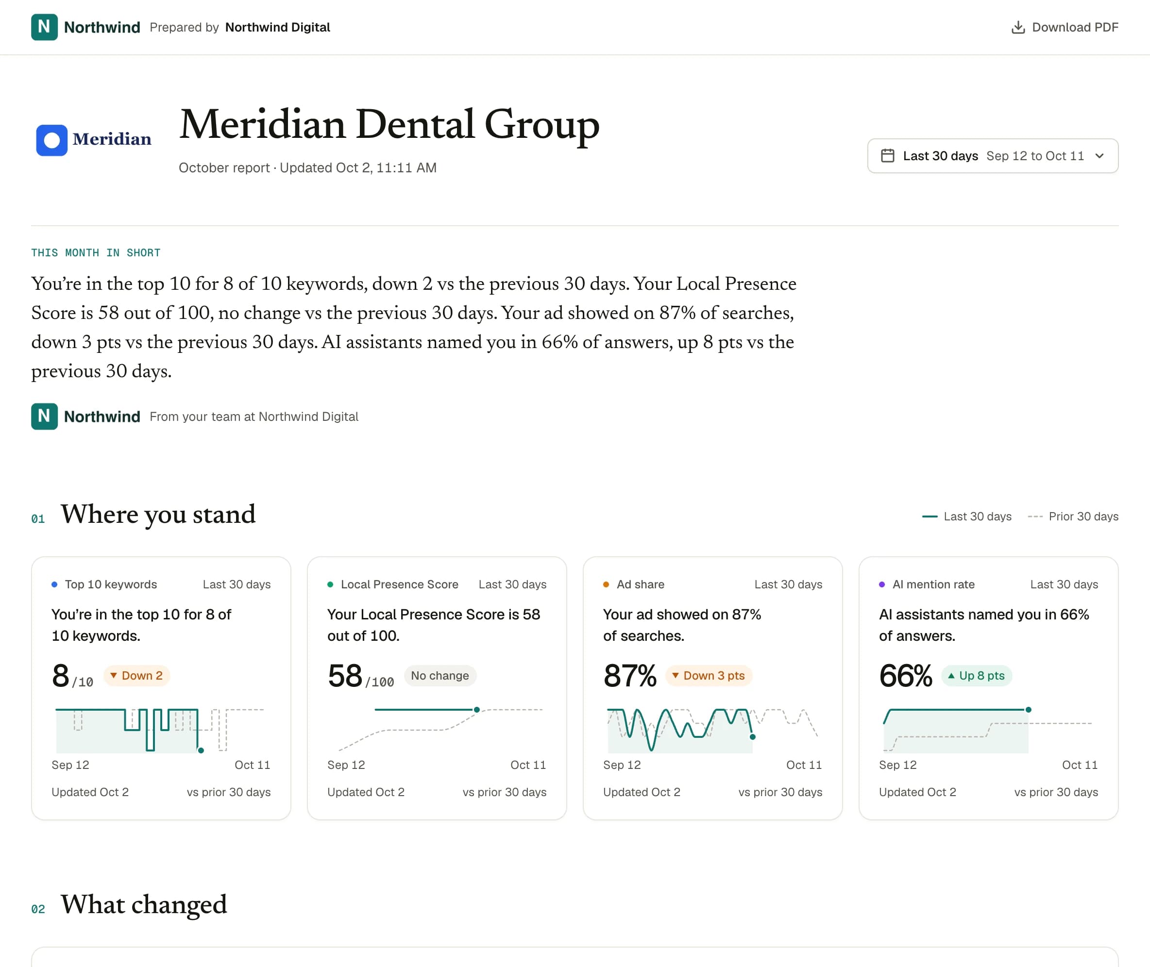
Answer lines first
"You're in the top 10 for 8 of 10 keywords." Each block states its finding in a sentence written from the live numbers, and the summary at the top writes itself.
Live and dated
Numbers come from the latest data when the page is opened, with the period, comparison and last update on every card.
Honest when data is missing
A check that is retrying is labelled as retrying, never shown as a drop.
One layout, four outputs
The client page, the editor canvas, the phone view and the PDF all read the same layout spec, so they never drift apart.
Details
The Parts That Make It Usable.
• Start in seconds: "Build it for me" picks blocks from what the agency already tracks for that client and writes every answer line. Or start from one of six goal templates.
• Phone order: the desktop grid flows to phone automatically, and any block can be reordered or hidden on phone without touching the desktop layout.
• White label: the agency's logo and colour with contrast checked automatically, a custom domain, and an optional "Powered by iSearchFrom" line.
• Competitor names hidden: rivals can appear as Competitor A, B and C, so a report never names other businesses to a client.
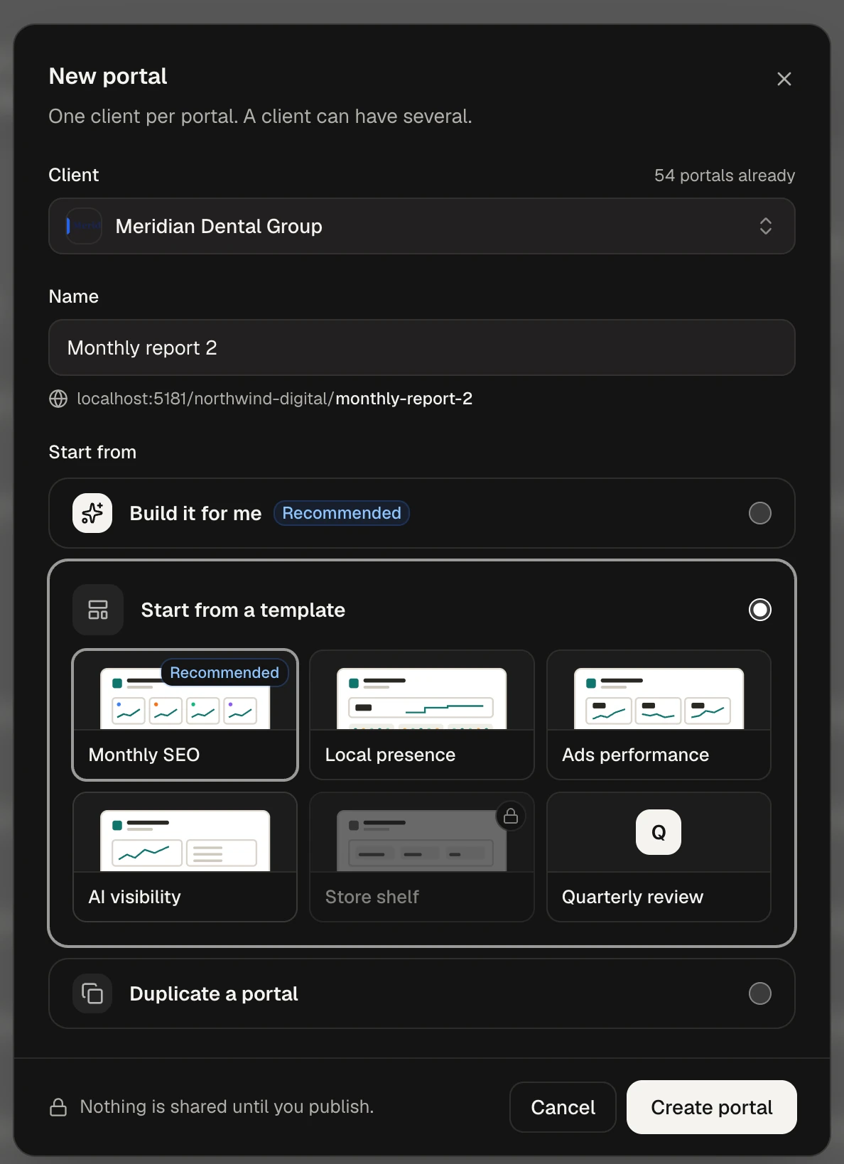
New portal: build it from tracked data, start from a goal template, or duplicate.
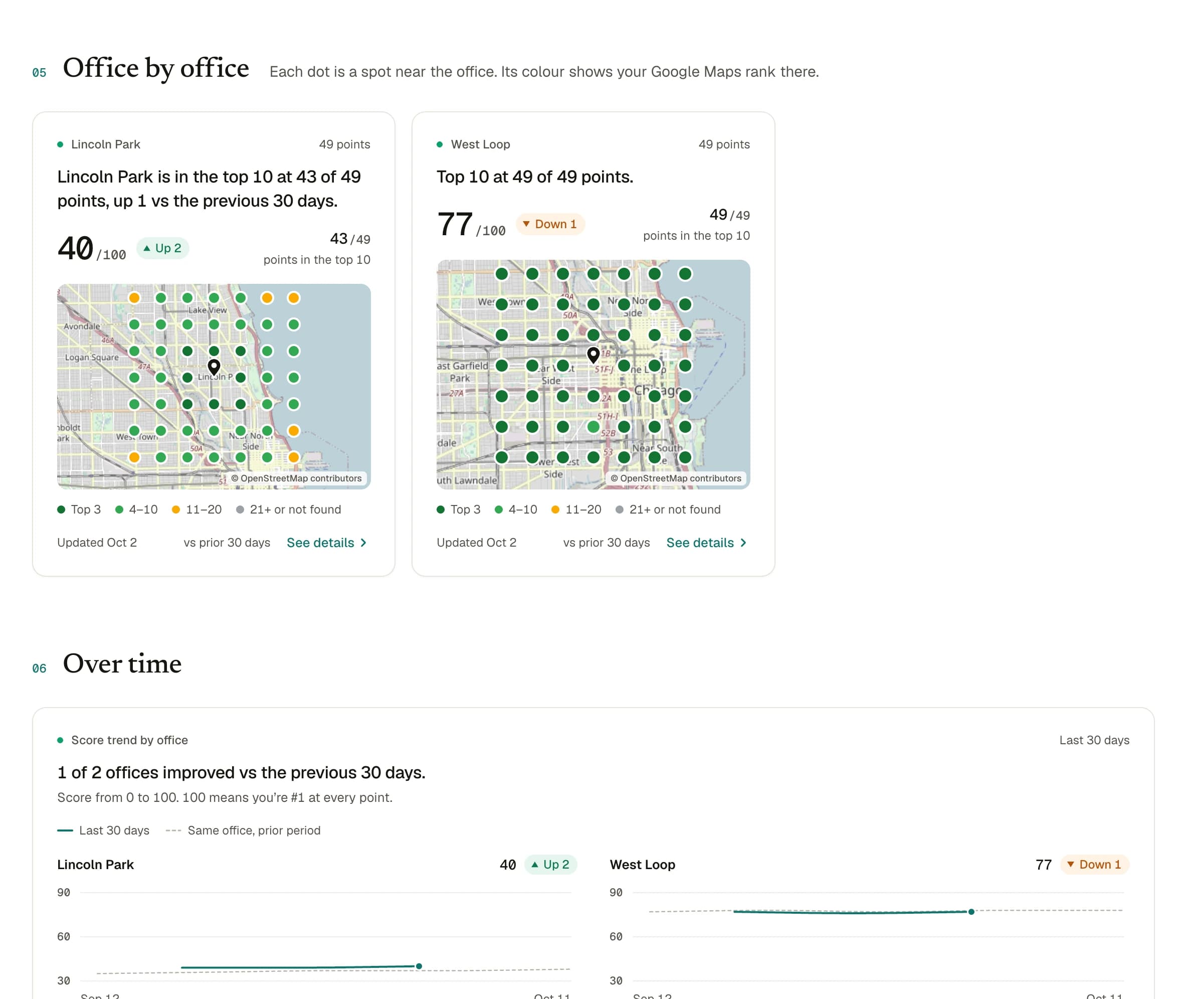
Office by office: a Maps grid per location, with the same answer-line pattern.
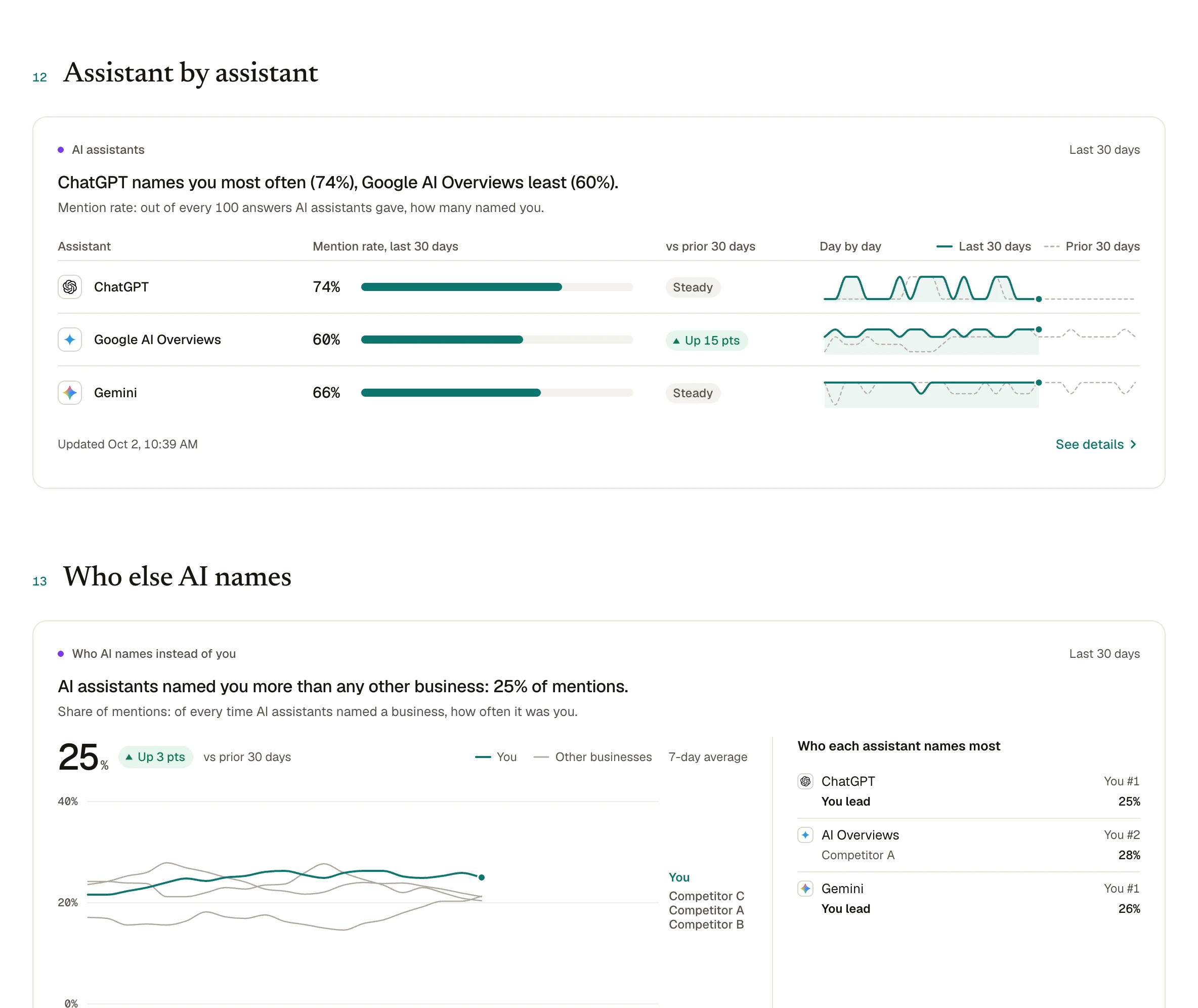
AI answers: mention rate per assistant and share of mentions against named competitors.
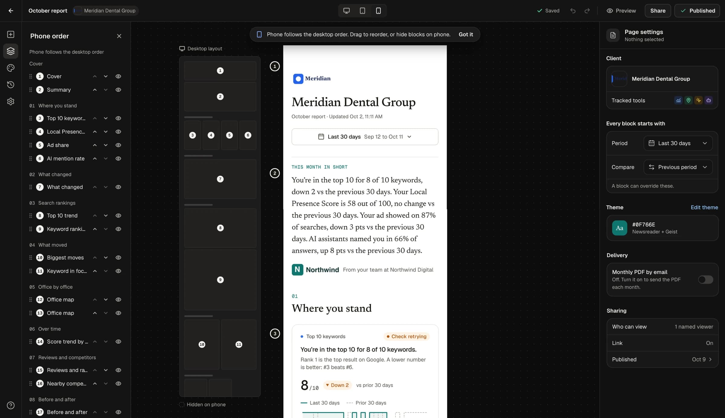
Phone order: reorder or hide blocks on phone without touching the desktop grid.
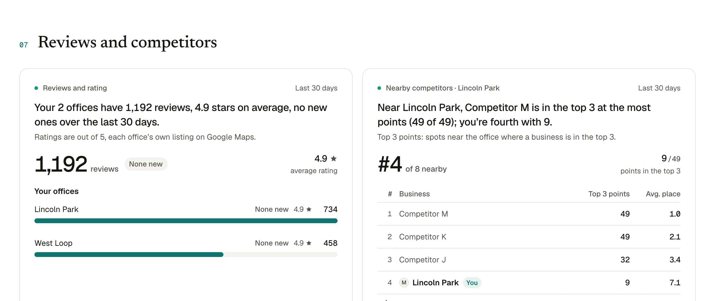
Competitor names hidden behind letters on a client-facing page.
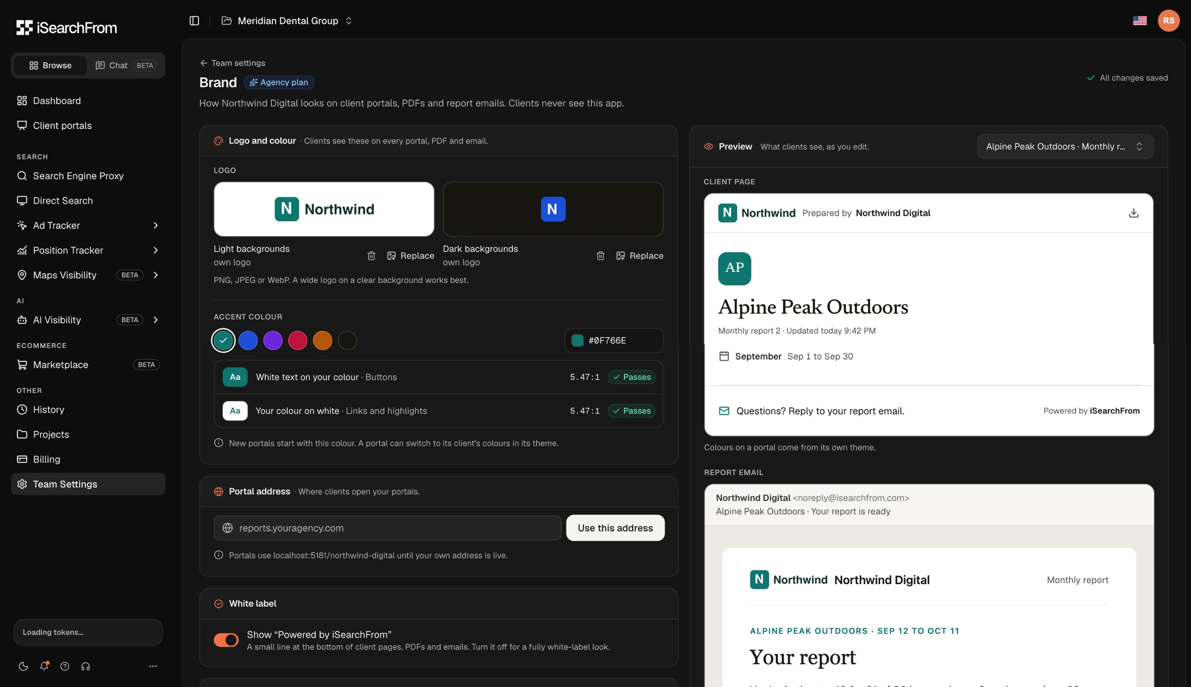
Brand settings with a live preview of the client page and the report email.
Quality
Using AI Agents as a QA Team.
Shipping this much with two people only works if quality keeps up. Before release I ran an agent-driven audit across every portal block, state and screen size, with a second pass of agents challenging each finding. It produced 184 confirmed issues, 7 of them high severity, and 173 were fixed in the same pass.
Among the catches: every quoted AI answer labelled "Named 1st", and a rival with a similar name shown as "You". Exactly the kind of quiet error that would cost an agency its client's trust. The portal also ships with 814 automated tests of its own.
Outcomes
What Shipped.
Aug 2026
New platform launched, with existing accounts migrated
2×
Real-IP search try rate from the winning hero (68% vs 34.8%)
15 → 59
Worst-case Safari frame rate on the landing page, in fps
57
Report blocks in the client portal editor
Learnings
What I Would Tell the Next Designer.
1. The free path is part of the product. The backlash taught us more about our users than any interview. Paying customers start as free users who trusted us first.
2. Design the failure states first. In a monitoring product missing data is normal. When it is designed, people trust the numbers that are there.
3. Test instead of debating. One clean experiment settled a question that opinions could not.
4. AI moves the bottleneck, it does not remove it. Agents get a screen to 80% fast. The last 20% (hierarchy, copy, edge cases) is still design work, and now it is most of the job.
Up Next